| ReportCat - The Java Report Print SDK Library |
Tutorial
This tutorial is a quick introduction to ReportCat. It includes useful
examples to learn the basic concepts of the architecture. To run the examples, you need a
Java 2 runtime environment (see java.sun.com) and at
least the ReportCat limited evaluation version (see download page). The full source code of all
examples and its compiled versions are also available in that package. References to these
examples are signaled with the symbol  .
.
At the end of this tutorial, you will be able to define and print reports. Please refer to
the API documentation for a more detailed description of all
members of the API.
Before you start, take a quick look at the overview document. It
will give you an idea of ReportCats functionality.
Links
Content
Package Structure
Hello World
Building a Print Preview
Using the GridPrint for Layouting
Adding Header and Footer
Printing Tables
Table Column Width
The Table Cell Drawers
Breaking Lines in Tables
What about another Table Look?
Borders and other Decorators
Printing Images
Scaling
Rotating
Reports with Multiple Columns
Printing Charts
The Rendering of Strings
Adding new Functionality
How to Connect a Report with its Data Set
Support
ReportCat is divided into the following four packages:
li.netcat.print |
The print package contains the basic interfaces, the print manager and the
preview panel. |
li.netcat.print.util |
This package contains the built in components (= prints) of ReportCat and
other utilities. |
li.netcat.print.util.text |
Here are some text processing utilities. |
li.netcat.print.table |
As in Swing, the table is a slightly more extensive component and occupies
its own package for clarity. |
Let's not step out of line and start with the legendary "Hello
World!" example:
HelloWorldExample
import li.netcat.print.*;
import li.netcat.print.util.*;

public class HelloWorldExample {

  public static void main(String[] args) {
    try {
      new PrintManager(new TextPrint("Hello World!")).print(true);
    }
    catch (PrinterException x) {
      x.printStackTrace();
    }
  }
}
As you can see, this code basically allocates a new instance of a TextPrint and uses the PrintManager to print the report. The
flag true causes the print dialog to pop up. The TextPrint is some sort of "print
control" and can be compared with a label. The package li.netcat.print.util contains
many more such print controls.
A print preview is a useful utility that shows the final layout of a
document before printing. Because the look and the layout of a print preview is project
specific, ReportCat only provides its main component, the PreviewPanel. The preview panel
represents one page of the report. It can be used to build a project specific print
preview. Here is an example implementation of a print preview:
PrintPreviewExample
public class PrintPreview extends JPanel implements ActionListener {
  private PreviewPanel _previewPanel;
  private JButton      _nextPageButton;
  ...define all buttons...

  public PrintPreview(Print print) {
    super(new BorderLayout(5, 5));
    setBorder(new EmptyBorder(5, 5, 5, 5));
    // create the preview panel
    _previewPanel = new PreviewPanel(print);
    // add the preview panel to my print preview
    add(new JScrollPane(_previewPanel), BorderLayout.CENTER);
    ...create and add all buttons...
  }

  public void actionPerformed(ActionEvent event) {
    Object source = event.getSource();
    if (source == _nextPageButton) {
      _previewPanel.nextPage();
    }
    else if (source == _previousPageButton) {
      _previewPanel.previousPage();
    }
    else if (source == _zoomOutButton) {
      _previewPanel.setZoom(_previewPanel.getZoom() / 1.3);
    }
    else if (source == _zoomInButton) {
      _previewPanel.setZoom(_previewPanel.getZoom() * 1.3);
    }
    else if (source == _scaleOutButton) {
      _previewPanel.getPrintManager().setScaleValue(_previewPanel.getPrintManager().getScaleValue() / 1.1);
    }
    else if (source == _scaleInButton) {
      _previewPanel.getPrintManager().setScaleValue(_previewPanel.getPrintManager().getScaleValue() * 1.1);
    }
    else if (source == _orientationButton) {
      int newOrientation = _previewPanel.getPrintManager().getOrientation() == PrintConstants.PORTRAIT ? PrintConstants.LANDSCAPE : PrintConstants.PORTRAIT;
      _previewPanel.getPrintManager().setOrientation(newOrientation);
    }
    else if (source == _resetButton) {
      PrintManager pm = _previewPanel.getPrintManager();
      pm.setPageFormat(pm.getPrinterJob().defaultPage());
      pm.setScaleValue(1.0);
      _previewPanel.setZoom(1.0);
    }
    else if (source == _pageDialogButton) {
      _previewPanel.getPrintManager().pageDialog(true);
    }
    else if (source == _printButton) {
      try {
        _previewPanel.getPrintManager().print(true);
        // or call the following if you don't want a dialog:
        //_previewPanel.getPrintManager().print(false);
      }
      catch (PrinterException x) {
        x.printStackTrace();
      }
    }
  }

  public JFrame open() {
    JFrame frame = new JFrame();
    frame.setContentPane(this);
    frame.pack();
    frame.setVisible(true);
    frame.setDefaultCloseOperation(JFrame.EXIT_ON_CLOSE);
    return frame;
  }

  private JButton createButton(String text) {
    JButton button = new JButton(text);
    button.addActionListener(this);
    return button;
  }
}
As you can see, the PreviewPanel
can easily be integrated into a custom preview. You may use the PrintPreview class of the
example as a base to implement your own preview.
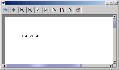
Now, let's reimplement our "Hello World!" example and use the
new print preview:
public class PrintPreviewExample {

  public static void main(String[] args) {
    new PrintPreview(new TextPrint("Hello World!")).open();
  }
}
Here is the resulting screenshot:
The scale command might seem unusual. In contrast to the zoom, this
command modifies the layout of the report! The whole report gets scaled, as if the size of
the paper changed, so more or less content will fit on one page.
You can also use two or more preview panels to have a simultaneous look at
more than one page. Just make sure, that all PreviewPanels are constructed with the
same PrintManager.
Since we now have a comfortable preview, we can focus on the definition of
reports. A report is simply an implementation of the Print interface. By convention, all
implementations of the Print interface end
with the word "Print". If you consider our first example, the TextPrint is a simple implementation of
the Print interface and represents a trivial
report that has only a text. More complex reports are defined by composing or decorating
simple prints to a more complex print (See the composite and the decorator design pattern
in the GOF-Book).
One of the most important "print control" is the GridPrint. It will be used in almost
every report to layout "print controls" of the report. The GridPrint implements the Print interface and has one or more child
prints. The next example shows the usage of the GridPrint:
GridPrintExample
Now, lets have a look at the code that defied this report:
public class GridPrintExample {

  public static void main(String[] args) {
    // as usual
    new PrintPreview(createPrint()).open();
  }

  public static Print createPrint() {
    // define some texts
    String t1 = "ein punkt richtet sich in seiner oberfläche auf ohne die Absicht den zenith zu erreichen doch mit sanfter neigung gegen";
    String t2 = "die achse eines semikolons das aus seiner";
    String t3 = "hängenden lage schwingen und wie eine";
    String t4 = "schiffsschaukel in den himmel steigen könnte bis es im scheitelpunkt einen moment stillsteht wie ein ausrufezeichen";
    String t5 = "wenn auch nur im vorübergehn und ohne hoffnung je wieder hier auszuruhn (Franz Mon)";
    // define the default grid print constraints. Its column span is "reminder".
    GridPrintConstraints c = GridPrintConstraints.DEFAULT;
    // define a grid print with a horizontal and vertical gap of 20
    // for this example, we use two boxed grid prints, the inner and the outer
    GridPrint inner = new GridPrint(20, 20);
    // add a text print with a column span of 1, i.e. the next print is on the same row.
    inner.add(new TextPrint(t2), c.colSpan(1));
    // add a text at the end of the current row
    inner.add(new TextPrint(t3), c);
    // add the next text
    inner.add(new TextPrint(t4), c);
    // allocate the outer grid, also with a gap of 20
    GridPrint outer = new GridPrint(20, 20);
    outer.add(new TextPrint(t1), c.colSpan(1));
    // add the inner grid print into the outer and set the weight of this
    // column to 2.0f so that this column gets twice as much space as the first column
    outer.add(inner, c.colWeight(2.0f));
    outer.add(new TextPrint(t5), c);
    return outer;
  }
}
As you can see, the GridPrint
works similar to the GridBagLayout. It has a grid with cells and (similar to
the GridLayout) horizontal and vertical gaps between the cells. Notice that
since all cells are occupied by implementations of the Print interface, the GridPrint supports a page break even in
the middle of a cell, not only between the rows.
Each cell has GridPrintConstrains
associated with it that define constraints like column span, width, or weight of the cell.
The current implementation does not support row span, so in this example, we used boxed GridPrints to simulate a row span. GridPrintConstrains is an
immutable class with "clone and modify" methods. The code c.colSpan(1)
returns a clone of the c object and sets the column span property to 1. This methodology
can also be used in a chain e.g. c.colSpan(1).colWeight(2.0f) that produces
easy readable code.
So far so good, but how can we add header and footer to this report? This
is solved with the PagePrint. It
wraps a Print by adding header and/or footer
to it on each page (decorator pattern). The header and footer are defied by the PageDecorator interface that works
like a factory, creating a header print and a footer print for each page. The following
example shows the details:
HeaderFooterExample
public class HeaderFooterExample {
public static void main(String[] args) {
// decorate the print of the grid example with a page decorator
new PrintPreview(new PagePrint(GridExample.createPrint(), createPageDecorator())).open();
}
public static PageDecorator createPageDecorator() {
return new MyPageDecorator();
}
// implementation of a page decorator
private static class MyPageDecorator implements PageDecorator {
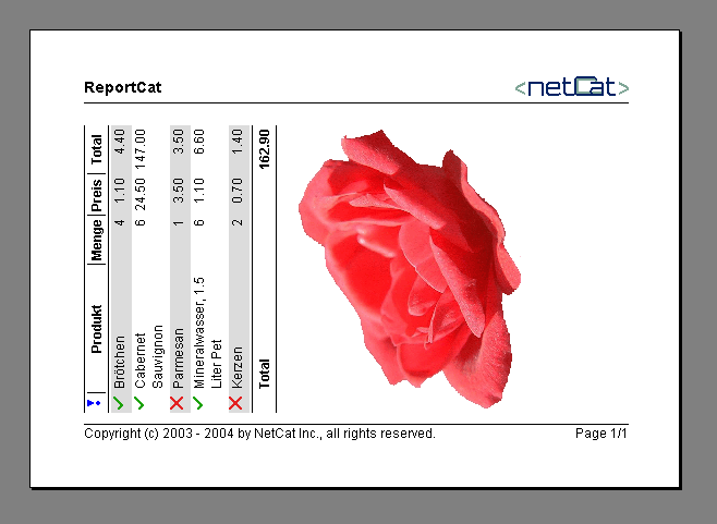
private static Image LOGO = ImageLoader.loadImage("./images/Logo.gif");
private Print _headerPrint;
//// constructors
public MyPageDecorator() {
TextPrint textPrint = new TextPrint("ReportCat");
textPrint.setFont(new Font(null, Font.BOLD, 14));
ImagePrint imagePrint = new ImagePrint(LOGO, 104, 18);
GridPrintConstraints c = GridPrintConstraints.DEFAULT;
GridPrint gp = new GridPrint();
gp.add(textPrint, c.colSpan(1));
gp.add(imagePrint, c.colWidthPreferred());
gp.add(new LinePrint());
_headerPrint = gp;
}
// factory method that creates the header for a page
// here, the header is always the same
public Print createHeader(PageNumber number) {
return _headerPrint;
}
public int getHeaderGap(PageNumber number) {
return 20;
}
// factory method that creates the footer for a page
public Print createFooter(PageNumber number) {
GridPrint gp = new GridPrint();
GridPrintConstraints c = GridPrintConstraints.DEFAULT;
gp.add(new LinePrint());
gp.add(new TextPrint("Copyright (c) 2003 - 2004 by NetCat Inc., all rights reserved."), c.colSpan(1));
gp.add(new PageNumberPrint(number), c.hAlignRight().colWidthPreferred());
return gp;
}
public int getFooterGap(PageNumber number) {
return 10;
}
}
}
Note that the header and the footer also implement the Print interface. All implementations can be
reused to build header and footer, and the GridPrint is used to do the layout.
This example also illustrates how the preferred size of a Print is used to define the width of a column or
the horizontal alignment of a cell.
In the previous section, we learned some aspects of the GridPrint. We could also use this class
to represent a whole table. This is not a bad idea when the table is not very regular and
has different types of content in each cell. But regular tables are often generated with
data from a database and have other preferences such as a header that should be repeated
on each page or a custom rendering of the cells.
So let's have a closer look at the TablePrint
and start with a simple example:
SimpleTableExample
public class SimpleTableExample {

  public static void main(String[] args) {
    new PrintPreview(createPrint()).open();
  }

  public static Print createPrint() {
    // create a data model for the table and return a table print
    return new TablePrint(new DinnerModel());
  }

}
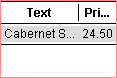
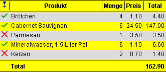
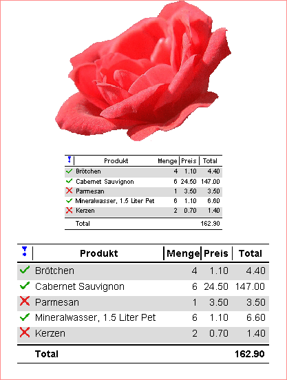
This code produces the following table:
The TableDataModel
defines the data of the table (similar to Swing). Here is the implementation used for the
example:
public class DinnerModel implements TableDataModel {
  private String[] _headers;
  private List _rows;
  private double _total;

  public DinnerModel() {
    _rows = new ArrayList();
    _headers = new String[]{"Produkt", "Menge", "Preis", "Total"};
    add("Brötchen", 4, 1.10);
    add("Cabernet Sauvignon", 6, 24.50);
    add("Parmesan", 1, 3.50);
    add("Mineralwasser, 1.5 Liter Pet", 6, 1.10);
    add("Kerzen", 2, 0.70);
  }

  public void add(String name, int amount, double price) {
    _rows.add(new String[] {name, Integer.toString(amount), format(price), format(amount*price)});
    _total += amount*price;
  }

  public int getRowCount() {
    return _rows.size();
  }

  public int getColumnCount() {
    return _headers.length;
  }

  public Object getValueAt(int rowIndex, int columnIndex) {
    return ((String[])_rows.get(rowIndex))[columnIndex];
  }

  public Object getValueTypeAt(int rowIndex, int columnIndex) {
    return getTypeAt(columnIndex);
  }

  public boolean hasHeader() {
    return true;
  }

  public Object getHeaderAt(int columnIndex) {
    return _headers[columnIndex];
  }

  public Object getHeaderTypeAt(int columnIndex) {
    return String.class;
  }

  public boolean hasFooter() {
    return true;
  }

  public Object getFooterAt(int columnIndex) {
    if (columnIndex == 0) {
      return "Total";
    }
    if (columnIndex == 3) {
      return format(_total);
    }
    return null;
  }

  public Object getFooterTypeAt(int columnIndex) {
    return getTypeAt(columnIndex);
  }


  //// private helpers

  private Object getTypeAt(int columnIndex) {
    if (columnIndex == 0) {
      return String.class;
    }
    return Number.class;
  }

  private static DecimalFormat format = new DecimalFormat("0.00");

  private String format(double value) {
    return format.format(value);
  }
}
As the example shows, the data model defines the number of rows and
columns, whether there are header and/or footer and the types and data values of all
cells. The types of the data values are only used to determine the appropriate cell
renderer (see next chapters)
How wide are the columns of a table? Well, there are a lot of parameters
that influence the widths of the table columns. First of all, a table can be left, center
or right aligned. In that case, we suppose that the table is not as wide as the available
width and all columns have their preferred widths. But in some cases, the table should be
as wide as the available width, so the additional width must be distributed among the
table columns. The worse situation occurs, if the preferred width of a table is wider than
the available width. Then, some or all columns must give away some space.
The following example shows a simple table centered, left, right aligned
(with only one row) and the same table that fits automatically to the available width.
TableColumnWidthExample
public class TableColumnWidthExample {

  public static void main(String[] args) {
    new PrintPreview(createPrint()).open();
  }

  public static Print createPrint() {
    // create four tables
    TablePrint table1 = createTable();
    TablePrint table2 = createTable();
    TablePrint table3 = createTable();
    TablePrint table4 = createTable();
    // add them to a grid print
    GridPrint grid = new GridPrint(20, 20);
    GridPrintConstraints c = GridPrintConstraints.DEFAULT;
    // center the first table
    grid.add(table1, c.hAlign(PrintConstants.CENTER));
    // second table is left aligned
    grid.add(table2, c);
    // third table is right aligned
    grid.add(table3, c.hAlign(PrintConstants.RIGHT));
    grid.add(table4, c);
    // forth table fits the available width
    table4.setFitWidth(true);
    return grid;
  }

  public static TablePrint createTable() {
    TablePrint table = new TablePrint(new MyTableDataModel());
    return table;
  }
}
The available width is shown with a red box. As you can see, the default
implementation distributes the additional width among all columns:
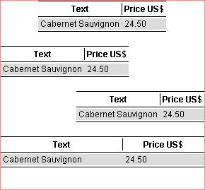
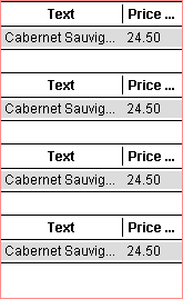
If we reduce the available width, the default implementation takes up
space form every column and the default cell renderer signals it with "...":
If you set the "weight" of a column to 0, then, this column does
not receive nor give away space. By specifying the weight to 2, the column receives twice
as much as cells with the default weight of 1. Note that the text column now has to give
away the full necessary width:
  public static Print createPrint2() {
    TablePrint table = createTable();
    // set the weight of the price column to 0.0f so that it doesn't get reduced
    table.setColumnWeight(1, 0.0f);
    table.setFitWidth(true);
    return table;
  }
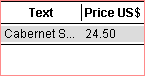
You may also specify a minimum column width in pixel, so that the price
column will be at least 100 pixel:
  public static Print createPrint3() {
    TablePrint table = createTable();
    // set the minimum column width of column 1 to 100
    table.setMinimumColumnWidth(1, 100);
    table.setFitWidth(true);
    return table;
  }
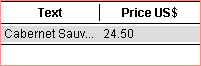
Or you may define a column constraint that says that the column should be
at least as wide as the preferred width of its data cells (and/or header and/or footer).
In our example, the string "24.50" will always be visible:
  public static Print createPrint4() {
    TablePrint table = createTable();
    // set the column width constraint that the column 1 must be at least
    // as wide as the preferred width of the column data cells
    table.setColumnWidthConstraint(1, TablePrint.CONSTRAINT_MIN_CELLS);
    table.setFitWidth(true);
    return table;
  }
All of the methods above can also be combined.
There are even more possibilities to influence the widths of the columns
of a table. The ColumnWidthCalculator
is the strategy that calculates the minimum, preferred and maximum column widths for a
table. You may implement your own strategy for this calculator and set it to the table by
calling
myTable.setColumnWidthCalculator(myCalculator);
The next step in the calculation of the column widths is the ColumnWidthDistributor.
It calculates the definitive widths of the columns of a table. You may also implement you
own strategy for this calculation and set it to the table by calling
myTable.setColumnWidthDistributor(myDistributor);
Last but not least, the row heights get calculated by the RowHeightCalculator in the
third step. It calculates the heights of the header, data rows and the footer. It can also
be set to the table with the call
myTable.setRowHeightCalculator(myCalculator);
The cells of a table are rendered by using one ore more instances of a TableCellDrawer. Table cell
drawers can be configured and registered with the table. This is done with the methods
TablePrint.setCellDrawer(Object type, TableCellDrawer drawer);

TablePrint.setDefaultCellDrawer(TableCellDrawer drawer);

TablePrint.setHeaderDrawer(Object type, TableCellDrawer drawer);

TablePrint.setDefaultHeaderDrawer(TableCellDrawer drawer);

TablePrint.setFooterDrawer(Object type, TableCellDrawer drawer);

TablePrint.setDefaultFooterDrawer(TableCellDrawer drawer);
The drawers of header, data cells and footer are configured independently.
The default drawers are used, when no specific drawer is specified. An arbitrary type
object is used to register the specific drawers. If the registered type object is equal to
the type object returned by the TableDataModel
the according TableCellDrawer
will be used to draw the data cell. The next example configures the table cell drawers so
that the numbers are right aligned and that the text occurs with an icon. Custom
implementations of cell drawers are quiet easy. The simplest way is to extend the DefaultTableCellDrawer as
this example shows:
TableRendererExample
Note that the type of the table cell is defined by the TableDataModel:
public class DinnerModel implements TableDataModel {

  ...

  public Object getValueTypeAt(int rowIndex, int columnIndex) {
    return getTypeAt(columnIndex);
  }

  public Object getFooterTypeAt(int columnIndex) {
    return getTypeAt(columnIndex);
  }

  ...

  //// private helpers

  private Object getTypeAt(int columnIndex) {
    if (columnIndex == 0) {
      return String.class;
    }
    return Number.class;
  }
}
The cell drawers are now configured using the same type objects. The type object can
also be any other object like new Integer(746) or "text column". It is only
important that the type object used to register the table cell drawer matches with the
type objects returned by the data model :
public class TableRendererExample {

  public static void main(String[] args) {
    new PrintPreview(createPrint()).open();
  }

  public static Print createPrint() {
    TablePrint table = new TablePrint(new DinnerModel());
    // set a right aligned cell drawer that paints the numbers
    // note that the DinnerModel returns Number.class for the number texts
    table.setCellDrawer(Number.class, table.createDefaultCellDrawer(PrintConstants.RIGHT));
    // set a right aligned footer drawer that paints the numbers
    table.setFooterDrawer(Number.class, table.createDefaultFooterDrawer(PrintConstants.RIGHT));
    // register my own table cell drawer for the text column.
    table.setCellDrawer(String.class, new MyCellDrawer());
    table.setFitWidth(true);
    return table;
  }

  // this example extends the DefaultTableCellDrawer that supports icons.
  private static class MyCellDrawer extends DefaultTableCellDrawer {
    private static final Icon _ok = new ImageIcon("./images/Ok.gif");
    private static final Icon _nok = new ImageIcon("./images/Nok.gif");

    //// overridden methods

    protected Icon getIcon(Object value, Object type, int rowIndex, int columnIndex) {
      // do some conversion
      if (rowIndex == 3) {
        return _nok;
      }
      return _ok;
    }

  }
}
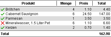
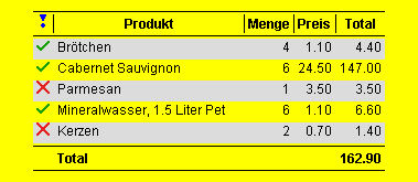
In this example, the MyCellDrawer calculates the icon of a
data cell and displays icon and text in the same column. It is also possible, that the
table data model itself returns an instance of an icon for a specific cell (see next
example).Note that the numbers are now right aligned:
You might also configure the font, color, insets of the DefaultTableCellDrawer:
    DefaultTableCellDrawer cellDrawer = table.createDefaultHeaderDrawer(PrintConstants.CENTER);
    cellDrawer.getDrawer().setFont(new Font(null, Font.BOLD | Font.ITALIC, 16));
    table.setDefaultHeaderDrawer(cellDrawer);
ReportCat contains also an implementation of a TableCellDrawer that supports
automatic line break. It creates manual line breaks at '\n' and adds automatic line breaks
where necessary. This example shows also the usage of icons in the header or in a column.
TableLineBreakExample
public class DinnerModelWithIcons implements TableDataModel {

  ...

  public Object getValueTypeAt(int rowIndex, int columnIndex) {
    return getTypeAt(columnIndex);
  }

  ...

  private Object getTypeAt(int columnIndex) {
    if (columnIndex == 0) {
      // want to confugure an own renderer for the icons. See class TableLineBreakExample
      return "this is an icon column";
    }
    if (columnIndex == 1) {
      // want to use a multi line renderer for this column. See class TableLineBreakExample
      return String.class;
    }
    // other columns get right aligned. See class TableLineBreakExample
    return Number.class;
  }

  private static DecimalFormat format = new DecimalFormat("0.00");

  private String format(double value) {
    return format.format(value);
  }
}
public class TableLineBreakExample {

  public static void main(String[] args) {
    new PrintPreview(createPrint()).open();
  }

  public static Print createPrint() {
    return createTable();
  }

  public static TablePrint createTable() {
    TablePrint table = new TablePrint(new DinnerModelWithIcons());
    // set a centered cell drawer that paints the icon
    // note that the DinnerModelWithIcons returns this rather unusual cell type
    table.setCellDrawer("this is an icon column", table.createDefaultCellDrawer(PrintConstants.CENTER));
    // set a right aligned cell drawer that paints the numbers
    table.setCellDrawer(Number.class, table.createDefaultCellDrawer(PrintConstants.RIGHT));
    // set a right aligned footer drawer that paints the numbers
    table.setFooterDrawer(Number.class, table.createDefaultFooterDrawer(PrintConstants.RIGHT));
    // register a multi line text cell drawer for the strings.
    table.setCellDrawer(String.class, new TextTableCellDrawer());
    // make sure that the columns 0, 2, 3 and 4 dont get shrinked width.
    // Real world code would use the data model or an other source to determine the column indices.
    // But we want to keep the example simple.
    table.setColumnWeight(0, 0.0f);
    table.setColumnWeight(2, 0.0f);
    table.setColumnWeight(3, 0.0f);
    table.setColumnWeight(4, 0.0f);
    table.setFitWidth(true);
    return table;
  }
}
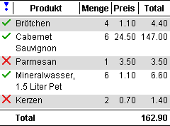
If the table is narrow enough, the lines of the product column will break
automatically:
It is important that the parameter used to register the table cell drawer
matches with the "type values" returned by the TableDataModel. The value itself
can be any object.
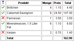
The table is an excellent object to define your own individual table look.
The table look is "the stuff between and behind the table cells". In the above TablePrint , the DefaultTableLook is used. It
paints the black lines and the alternate background and defines all the gaps between the
rows and columns and the insets around the table. You might define your own look that
implements the interface TableLook
and set it to the table. The cells are drawn by implementations of the TableCellDrawer interface and
are completely independent of the look:
TableLookExample
Here comes the code that produced this table:
public class TableLookExample {

  public static void main(String[] args) {
    new PrintPreview(createPrint()).open();
  }

  public static Print createPrint() {
    // lets use the table of the TableLineBreakExample
    TablePrint table = TableLineBreakExample.createTable();
    // set my own look to the table.
    table.setLook(new HtmlTableLook());
    return table;
  }
}
The custom table look implements the TableLook interface that has only two
metods:
public class HtmlTableLook implements TableLook {
  private TableMargins _margins = new TableMargins(4, 4, 4, 4, 4, 4, 4, 4);
  ...

  //// interface TableLook

  public TableMargins getTableMargins(TablePrint print, Graphics g) {
    return _margins;
  }

  public void paint(TablePrint print, Graphics g, int x, int y, int[] columnWidths, int[] rowHeights, int headerHeight, int footerHeight) {
    ...some painting stuff...
  }
}
You will find the complete source code of this example in the evaluation
package (see download page).
Borders, backgrounds and other functionality are added by
"decorating" an existing print. The decorator pattern (see GoF) has the
motivation: "Attach additional capabilities to objects dynamically. Decorators
provide a flexible alternative to sub classing for extending functionality". Let's
start with a simple example:
DecoratorExample
The code
new BackgroundPrint(new TextPrint("This TextPrint is decorated
by a BackgroundPrint."), Color.yellow);
generates a print that looks like this:

Note that the BackgrondPrint can
decorate any other print. Lets decorate the print of the TableLineBreakExample with a
yellow bakcground:
new BackgroundPrint(TableLineBreakExample.createPrint(), Color.yellow);
Imagine the power of the decorator Pattern!
There are other decorators available in ReportCat. The InsetsPrint is used to add additional
space around a given print. For example, the code
  public static Print createInsetsPrint() {
    // define insets top:10,left:30,bottom:10,right:30
    Insets insets = new Insets(10, 30, 10, 30);
    // decorate print of example TableLineBreakExample with insets
    Print print = new InsetsPrint(TableLineBreakExample.createPrint(), insets);
    // make insets visible with a background print
    return new BackgroundPrint(print, Color.yellow);
  }
decorates the table of the TableLineBreakExample with insets and then with
a yellow background:
Another useful decorator is the BorderPrint. As the name suggests, it
decorates a given print with a border. But how does the border look like? Well, the look
of the border is defined by the interface PrintBorder. There is also a simple
implementation called LinePrintBorder
that paints a solid line as border. The following example shows how to use the LinePrintBorder in combination
with the BorderPrint.
  public static Print createBorderPrint() {
    Print print = new TextPrint("This TextPrint is decorated by a BorderPrint that uses a LinePrintBorder.");
    // define the border
    LinePrintBorder border = new LinePrintBorder();
    // define insets top:10,left:30,bottom:10,right:30
    border.setInsets(new Insets(10, 30, 10, 30));
    // decorate print with border
    return new BorderPrint(print, border);
  }
This code decorates a text print with a line border. Of course, it might
also decorate any other element of the report including whole GridPrint objects:

Note that BackgrondPrint
and BorderPrint can also be
combined, i.e. a decorator can decorate an already decorated object.
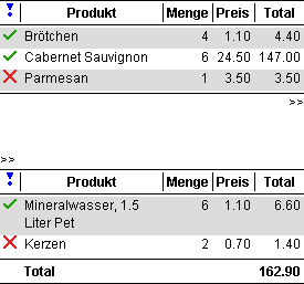
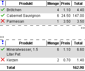
If an automatic page break divides a table in two or more parts, it is
often required that this break is visualized by some sort of text or symbol, for example
the text ">>":
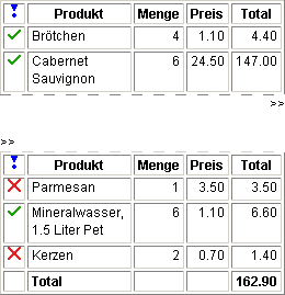
This feature is not a property of the table, it's an independent
decorator, i.e. it can be used to decorate any component, not only a table! But how is it
implemented? It is a special border that paints the text ">>" before and
after a page break:
  public static Print createDecoratedTable() {
    // note that we can decorate any print, it must not be a table
    Print print = TableLineBreakExample.createPrint();
    // define a border that uses a drawer before and after a page break
    // the default constructor paints ">>" before and after the break
    DrawerPrintBorder border = new DrawerPrintBorder();
    // decorate print with border
    return new BorderPrint(print, border);
  }
As you can see in this example, the BorderPrint in combination with a DrawerPrintBorder is used to
decorate the table. The DrawerPrintBorder
is an implementation of a border that draw some symbol before and after a page break. The
look of the symbols are again defined by two Drawer
delegates.
You might also define your own border that can decorate any print. A
custom border just has to implement the PrintBorder interface which has only
two methods. Let's implement a special border for our HTML table look:
In the above example, there are even two borders around the table: The
outer paints the hint ">>" to the lower left corner. The inner border
paints a white dashed line over the solid line of the table. Here is the implementation of
the HtmlTableBorder:
public class HtmlTableBorder implements PrintBorder {
  private static final PrintInsets MARGINS = new PrintInsets(0, 0, 0, 0, 0, 0);

  //// interface PrintBorder

  public PrintInsets getPrintInsets(Print print, Graphics g) {
    return MARGINS;
  }

  public void paint(Print print, Graphics g, PrintInsets margins, int x, int y, int width, int height, boolean topOpened, boolean bottomOpened) {
    g.setColor(Color.white);
    if (topOpened) {
      dashLine(g, x, y, width, 1);
    }
    if (bottomOpened) {
      dashLine(g, x, y+height-1, width, 1);
    }
  }

  private void dashLine(Graphics g, int x, int y, int width, int height) {
    for (int dx = 10; dx<width; dx+=20) {
      g.fillRect(x+dx, y, 10, height);
    }
  }
}
This border implementation can also be used to decorate the default table look, because
the default look as also a solid line at the beginning and at the end of the table:
High-resolution raster images are printed using the ImagePrint. To get good results on a
high-resolution printer, use a "big" image and specify a smaller size in the
constructor of the ImagePrint.
Depending on the resolution of the device, the image gets automatically scaled
accordingly.
Scaling is a powerful feature when a lot of content must be placed on one
page. The ScalePrint has been
designed for this purpose. It acts as a decorator of another Print so it can be used to scale any other
print. The ScalePrint can be
configured to scale with an absolute scale factor and/or it can adjust the scale
dynamically. Let's have a look at the following code:
ScaleExample
public class ScaleExample {
  public static Image FLOWER = ImageLoader.loadImage("./images/Flower.gif");

  public static void main(String[] args) {
    new PrintPreview(createPrint()).open();
  }

  public static Print createPrint() {
    // need some elements to print
    TablePrint table1 = TableLineBreakExample.createTable();
    table1.setFitWidth(false);
    TablePrint table2 = TableLineBreakExample.createTable();
    table2.setFitWidth(false);
    Print image = new ImagePrint(FLOWER, 256, 204);
    // add them to a grid with hgap and vgap of 20
    GridPrint grid = new GridPrint(20, 20);
    GridPrintConstraints c = GridPrintConstraints.DEFAULT.hAlignCenter();
    // the image should be auto scaled if it doesnt fit on the page
    grid.add(new ScalePrint(image, ScalePrint.MODE_AUTO_WIDTH), c);
    // the table 1 has a fix initial scale of 0.75 and gets also auto scaled
    grid.add(new ScalePrint(table1, 0.75, ScalePrint.MODE_AUTO_WIDTH), c);
    // the table 2 has a fix initial scale of 1.2 and gets also auto scaled
    grid.add(new ScalePrint(table2, 1.2, ScalePrint.MODE_AUTO_WIDTH), c);
    return grid;
  }
}
All three prints are wrapped with its own ScalePrint with automatic scale
adjustment. The image is only auto scaled, and the two tables have an initial scale factor
of 0.75 and 1.2 respectively. The next two screenshots show the behavior of the resulting
report. First, let's give it enough width (the red line shows the available size):
The flower shows in its preferred width and the tables get scaled by their
initial scale factors. Now, let's narrow the available width:
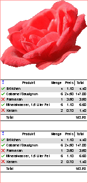
As you can see, all three components get automatically scaled so that they
fit exactly in the available width. All columns of the two tables are still visible.
Similar to the ScalePrint,
the RotatePrint is also a
decorator. It is able to rotate any Print by
0, 90, 180 or 270 degrees. The following screenshot shows an example:
RotateExample
Depending on the boxing, only parts of the report can be rotated. In this
example the header does not get rotated. Here comes the code for this example:
public class RotateExample {

  public static void main(String[] args) {
    // decorate the rotated print with header and footer
    new PrintPreview(new PagePrint(createPrint(), HeaderFooterExample.createPageDecorator())).open();
  }

  public static Print createPrint() {
    // need some elements to print
    TablePrint table = TableLineBreakExample.createTable();
    table.setFitWidth(false);
    Print image = ScaleExample.createImagePrint();
    // add them to a grid with gaps 20, 20
    GridPrint grid = new GridPrint(20, 20);
    // use constraints that puts the components in the center
    GridPrintConstraints c = GridPrintConstraints.DEFAULT.hAlignCenter();
    grid.add(table, c);
    grid.add(image, c);
    // return the ratated grid
    return new RotatePrint(grid);
  }
}
The SplitPrint is
also a decorator and is able to divide any Print
into two or more columns. Depending on the boxing, only parts of the report get split. In
this example, header and footer don't get split, they cover both columns:
SplitExample
The previous report has been generated by the following code:
public class SplitExample {

  public static void main(String[] args)	{
    // decorate the splitted print with header and footer
    PrintPreview preview = new PrintPreview(new PagePrint(createPrint(), HeaderFooterExample.createPageDecorator()));
    // set the default orientation to landscape
    preview.getPreviewPanel().getPrintManager().setOrientation(PrintConstants.LANDSCAPE);
    preview.open();
  }

  public static Print createPrint() {
    GridPrint gp = new GridPrint(20, 20);
    // add some prints of the previous examples to the grid
    gp.add(TableLineBreakExample.createPrint());
    gp.add(TableLookExample.createPrint());
    gp.add(GridPrintExample.createPrint());
    gp.add(TableColumnWidthExample.createPrint());
    gp.add(DecoratorExample.createPrint());
    gp.add(ScaleExample.createPrint());
    gp.add(RotateExample.createPrint());
    return new SplitPrint(gp);
  }
}
See the detailed API of the SplitPrint for further attribute
settings.
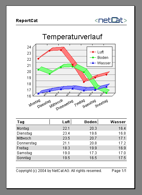
An important part of clearly arranged reports are charts. For that
purpose, NetCat provides its own library called Java Graph and Chart Engine
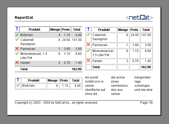
(ChartCat) that integrates seamlessly into ReportCat. See the tutorial of
ChartCat to learn how to integrate charts into a report:
Rendering strings in Java is an ongoing saga. Especially the exact
determination of the advance width of a string seems to be quiet complex (think of kerning
etc.). The advance width of a string is used to calculate the preferred with of a label or
to right align a text. The default implementation of ReportCat uses the API of Java
(FontMetrics) to determine the advance width of a string. This might not produce the best
possible results on all platforms. There might be a slight deviation probably visible in
right aligned text. If the precision of string rendering is not sufficient, you may extend
the StringDrawDevice and
provide you own implementation that will be used by all components.
Another important aspect in rendering strings is the automatic line break.
You might also implement your own LineBreakStrategy that
uses some sort of hints to breakup words.
As we saw in this tutorial, ReportCat contains the most important
components to create prints and reports in Java. The architecture of ReportCat has a lot
of flexibility for custom configuration and plugins. It is possible to add new
functionaliy for example by extending existing classes or by implementing new instances of
the Print interface.
The following example shows the implementation of the custom LinePrint
that has been used in the previous examples to separate the header and footer from the
body:
public class LinePrint implements Print {

  //// interface Print

  public Dimension getPreferredSize(Graphics g, Dimension out) {
    out.width = 1;
    out.height = 1;
    return out;
  }

  public PrintIterator getPrintIterator() {
    return new LinePrintIterator();
  }

  //// inner classes

  private static class LinePrintIterator implements PrintIterator {
    private boolean _available = true;

    //// interface PrintIterator

    public boolean hasNext() {
      return _available;
    }

    public Painter getNext(Graphics g, int width, int height) {
      _available = false;
      return new LinePainter(width);
    }
  }

  private static class LinePainter extends FixSizePainter {

    //// constructor

    public LinePainter(int width) {
      super(width, 1);
    }

    //// implementation of abstract metods

    public void paint(Graphics g, int x, int y) {
      g.setColor(Color.black);
      g.fillRect(x, y, super.getWidth(), super.getHeight());
    }
  }
}
As you can see, there are three interfaces involved when you want to
implement your own print. Inner classes are the best choice to implement the PrintIterator and the Painter interfaces.
All the examples above use reports with "hard coded" data. This
is done to keep the examples simple. However, a real world report must of course be drawn
from an arbitrary data source. This is best done with the "Abstract Factory"
design pattern (see GoF). First you need to define your data source that delivers the data
for one report instance. For example:
public interface DataSource {

  public String getName();

  pubilc String getMainText();

  public TableDataModel getTableData();

  public Icon getLogo();

  // etc...
}
Then you may define an interface that creates probably differend kind of
reports:
public interface ReportFactory {

  public Print createSummaryReport(DataSource source);

  public Print createDetailReport(DataSource source);

  // etc...
}
The implementation of the report factory gets implemented like this:
public class MyReportFactory implements ReportFactory {

  public Print createSummaryReport(DataSource source) {
    return new TextPrint(source.getMainText());
  }

  public Print createDetailReport(DataSource) {
    GridPrint grid = new GridPrint(10, 10);
    // define report ...
    return grid;
  }
  // etc...
}
The implementation of the data source might use an SQL result set, a file,
a dialog or an EJB to retrieve its data. This factory architecture has the advantage that
you can change the look of all different reports simply by providing another factory
implementation.
Don't hesitate to contact contact@netcat.li
if you need any support or if you miss some functionality. We admire your feedback and
need it to improve the product and the documentation. We are also able to add
common needed functionality to ReportCat for FREE within short time!
Copyright © 2003 - 2004 NetCat Inc..
All rights reserved.
Print,Printing,Printer,Java,Java Print,SDK,Java Printing,Printing Java,Print Java,Library,Java Library,Print Library,Report,Reports,Java Report,Java Programming,Java Output,Layout,Page,API,Preview,Print Preview,Content,A4,Free,Output,Header,Footer,Download,Package,Jar,Evaluation,
Print,Printing,Printer,Java,Java Print,SDK,Java Printing,Printing Java,Print Java,Library,Java Library,Print Library,Report,Reports,Java Report,Java Programming,Java Output,Layout,Page,API,Preview,Print Preview,Content,A4,Free,Output,Header,Footer,Download,Package,Jar,Evaluation,
Print,Printing,Printer,Java,Java Print,SDK,Java Printing,Printing Java,Print Java,Library,Java Library,Print Library,Report,Reports,Java Report,Java Programming,Java Output,Layout,Page,API,Preview,Print Preview,Content,A4,Free,Output,Header,Footer,Download,Package,Jar,Evaluation